Quick Navigation
Let’s build a live-updated visual to help viewers quickly see their state’s current risk of a viral infection by the three most common viruses (flue, Covid, and a cold/RSV). We’ll use Zapier for automation, CDC.Gov for data, Google to store our csv values, and Tableau for the live, interactive visual! (Skip to the dashboard)
0. Planning
Project always go smoother when you plan and create an outline first.
The basic steps to create a live visualization in Tableau Public requires Google Drive in addition to our data source. We know we need to request the data from data.CDC.gov, so we have to work with their API. We also know an automation service will be necessary to facilitate data transfer and scheduling.
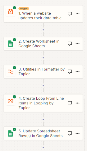
Here’s our basic framework flow:
![]()
1. Automation
First we need to identify an appropriate trigger for our automation flow.
A thorough review of the CDC’s database documentation tells us they update their data on Sunday evening. Given such a lengthy time period between updates, a simple time of the week trigger is sufficient here. I chose 6AM ET to allow for variations in upload time.
If the data were updated more frequently, I would set up a webhook notifying the software of a change in the database with restrictions or delays to not overwhelm our infrastructure.
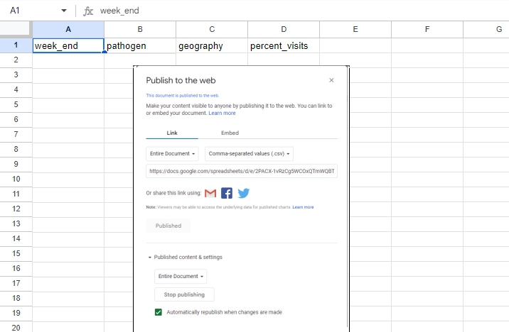
1.a Google Setup
I setup a Google Sheet with the appropriate Headers, ready to receive incoming data. I also published to document so Tableau had the appropriate web address to update its visualizations automatically.
Now because for this project we are only interested in the most up-to-date data, I chose to overwrite the document. If my goal was to keep track of changes over time or maintain a database on our infrastructure, I would Identify the Sheet and Add Rows. I would also add a primary key column since our datasource does not contain any unique identifiers.
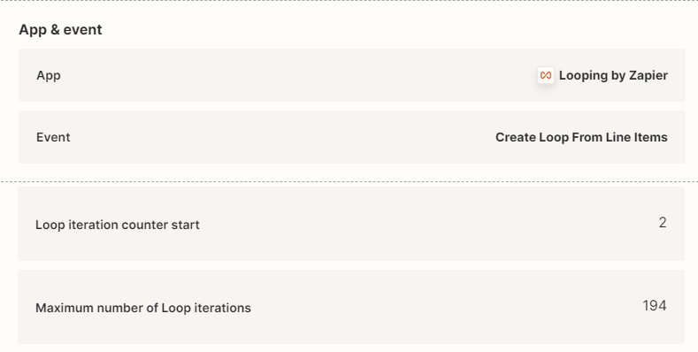
1.b Limits
Normally data needs to be cleaned upon importing it, however our dataset is exceptionally simple (only four columns) and no further information is necessary within our scope. SODA API and Zapier also allow us to limit the rows imported into our data set. Under other circumstances, SQL filtering would be required.
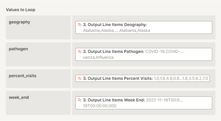
Here, I have limited the iterations of rows retrieval to 193 (the total rows for each weekly data dump, defined by pathogens + States & territories) and started the loop at “2” to prevent overwriting Headers. The Overwrite function will prevent any older data from corrupting our dataset.
2. Confirmation
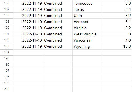
To test if our automation is functioning correctly, I uploaded the entire dataset to our Google Sheet.
If our automation overwrites the file with only the most recent, then a Sheet with only 194 (including headers) confirms it worked!

3. Organize and Visualize
Let’s talk design choice. I want this visual to allows users to quickly identify their location and get a simple understanding of their current viral hospitalizations (their local risk).
To address the speed component, a heat map visual is our best bet since we don’t know the location (beyond the United States) of our viewers. Viewers are familiar with a map of the US and can quickly glance at their state. We’ll color code the states green to red in order of least concern to most concern. I chose green and red because most people in the US consider red to be negative or bad, with green being positive. For other countries we want to consider local preferences, such as in China where green is associated with negative outcomes and red positive outcomes.
I broke the color scheme into 11 steps based on the CDC’s preferred color schema. Many steps allow the user to see depth without delving into the actual numbers for comparison. This part is particularly important because, like moving the y axis to emphasize or obscure the magnitude of our observations, we don’t want to mislead viewers to thinking a 0.1% difference in hospitalizations is enormous. Whereas a 1% change in hospitalizations for an uncommon virus IS a big difference, especially for total hospitalizations across all illnesses!
Now we also have different pathogens to consider. The flu also isn’t the only virus going around. There’s also rhinovirus (the common cold) and SARS-CoV2 (CoVID). The flu, RSV, and covid are all airborne viruses as well, so combining them into one visual is appropriate without losing or distorting our data. If the viewer is concerned about individual viruses, they can always move forward in the Story or jump to the specific virus using the quick links at the top.
Lastly, I added a list of hospitalization rates by state with the largest percentage of hospitalizations at the top. This allows viewers to quickly see the highest risk states and what their comparative risk is. The visualization is interactive as well, so viewers can reorder the states alphabetically (if they’re not familiar with US geography) or click on their home state to check the actual value the color represents.
Click the image below to see the interactive version at Tableau!

Unfortunately Zapier’s changes to the free plan does not allow my automation to continue updating this visualization. I uploaded the most recent data manually. I may recreate this project in another automated software in the future, but for now I will leave it up.
Credit to Tableau Public for the interactive dashboards https://public.tableau.com/app/profile/c.baringer/vizzes
Credit to Zapier for providing automation tools compatible with Tableau
Credit to the CDC and the US hospitals for providing data on viral hospitalizations
https://data.cdc.gov/Public-Health-Surveillance/2023-Respiratory-Virus-Response-NSSP-Emergency-Dep/vutn-jzwm
Credit to Creatly for the project management flowchart
