Quick Navigation
0. Prompt
We have been given a dataset containing customer and product sales data for a large coffee retailer in the US.
Marketing has asked us to help identify which products are most popular for different geographic markets. Leadership will also be present for this meeting. Knowing our audience will help tailor the project!
Our goal is to identify relationships between customer’s purchases (specific products ordered) and their geographic location (based on zip code or city).
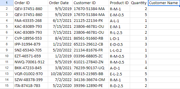
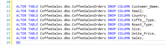
## Notice In the first picture of the [Orders] table, Customer Name (and several others) is blank. I believe this is an artifact from a previous analyst prior to upload to Kaggle. I have deleted the rows as part of good data-keeping practices 🙂
Source: Kaggle

1. Cleaning
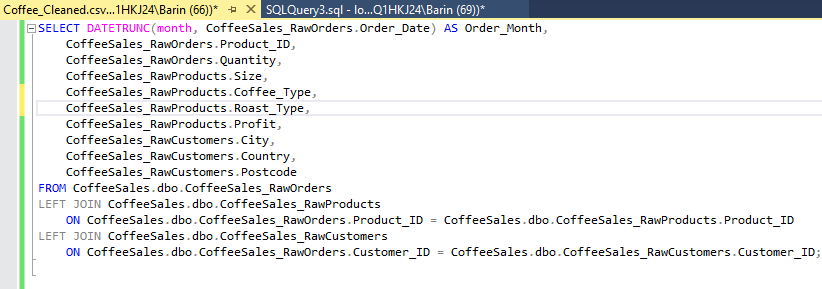
I uploaded the raw dataset into MySQL Server as a database so I could manipulate it with T-SQL.
I noticed that our order dates were too specific for our limited volume and diluted them to only months. Now when we plot our sales, the graph will be less noisy.
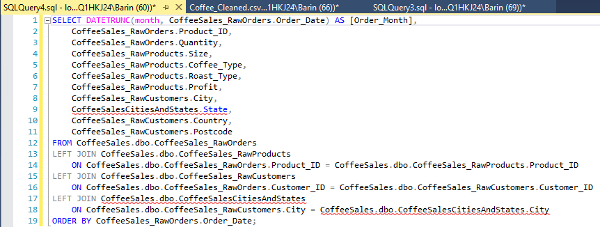
First I identified the relevant columns to Select for our visualizations, then joined the Products table [RawProducts] and Customer info table [RawCustomers] to our Orders table [RawOrders] so all our data is in one place.
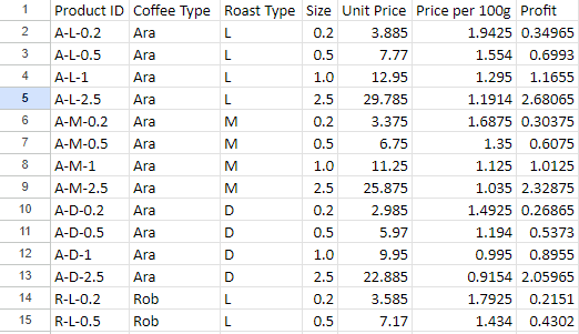
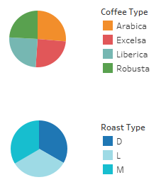
Our coffee is separated into several categories like bean type [Coffee_Type] and roast level [Roast_Type]. So we will do a separate query to identify the distinct categories. Our results reveal Dark, Medium, and Light roasts as well as arabica, excelsa, liberica, and robusta beans.
I then deleted the blank columns mentioned in the prompt.
2. Additional Tables
I noticed there is no state information in our [RawCustomers] table. So I went to Wikipedia and downloaded a table containing US cities and their state. Adding this information will make grouping cities by region MUCH easier.
After uploading the table to our database, I added another join and the appropriate columns to the SELECT statement.
Now our data is ready for export to Tableau!
3. Filters
Marketing defined our regions based on our established shipping hubs. To split our data, I applied these filters:
West:
WA, OR, CA, HI, AZ, UT, NM, AK, MT
Central/Midwest:
CO, OK, TX, LA, MO, IL, WI, IN, MI, ND, SD, MN
South:
AL, FL, NC, SC, TN, GA
East Coast:
NY, VA, MD, PA, NJ, OH, VT, MA, NH
UK
Ireland and the United Kingdom

4. Visualize and Discussion
Now that we have clean and relevant data, let’s visualize the relevant information and put together a story.
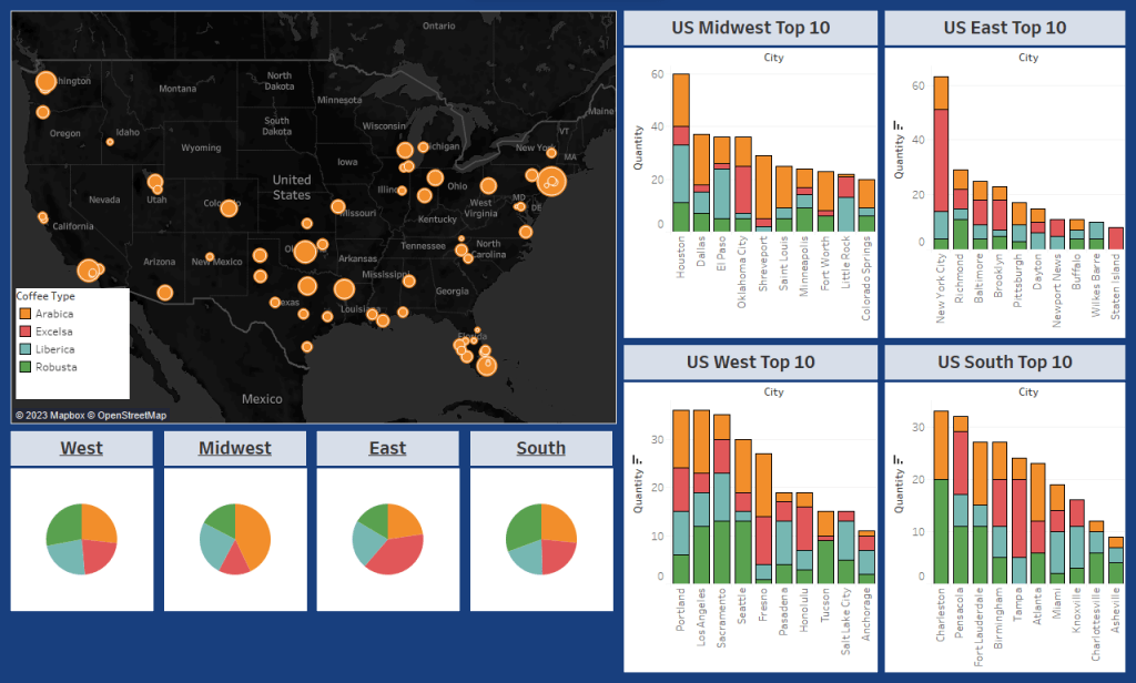
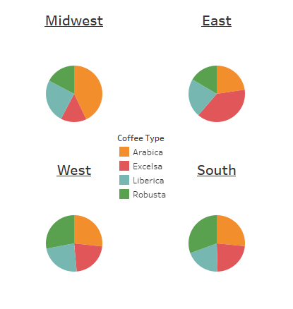
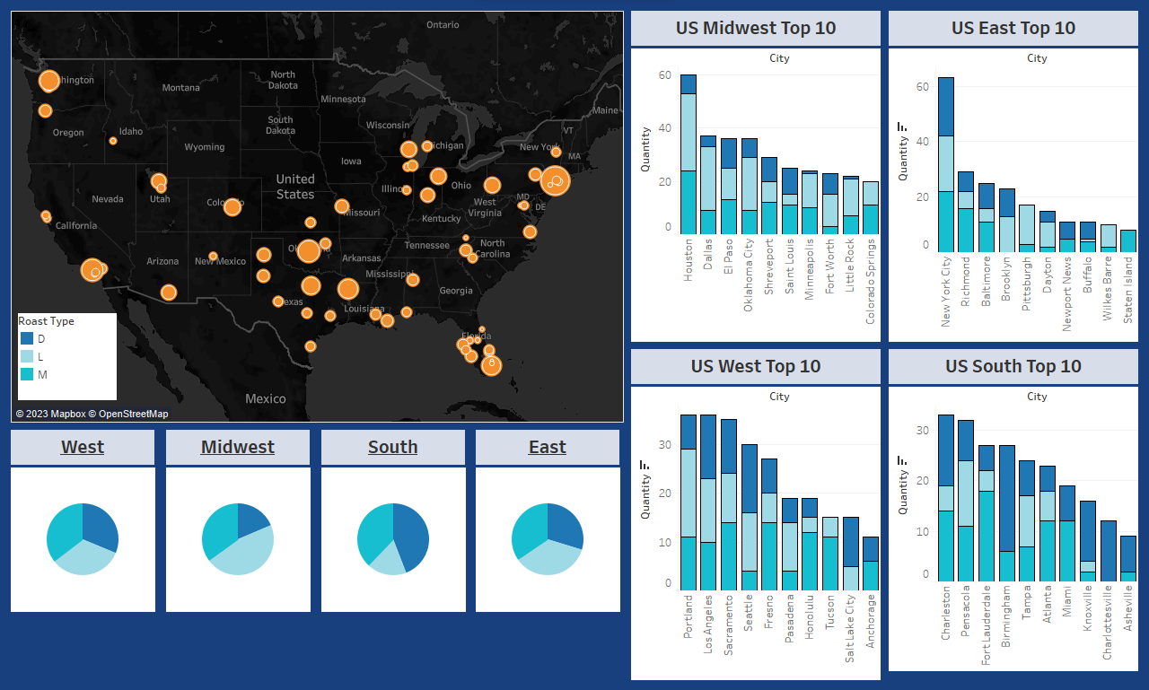
I put together a map to help visualize which cities are purchasing the most coffee and their proximity to other cities in the region. From here we can get more specific. Each region has a pie chart to help identify any broad trends or preferences in the Type of coffee consumed.
We can see a modest preference for Robusta in the West and the South, while the Midwest drastically prefers Arabica and the East drastically prefers Excelsa. From here, if our only concern is shipping logistics and inventory, we actually already have enough data to make changes effectively. Because these regions are quite large and many cities make up each region, sales will regress to the mean and the nitty gritty is more icing than cake. We can tailor inventory to sales based on percentage. But sales aren’t everything, what if Marketing wants to identify which city to test new coffee beans? We’ll want to break out the precision tools and look at specific cities to see if the trends hold up across the region, or if a large city/market is skewing our results.
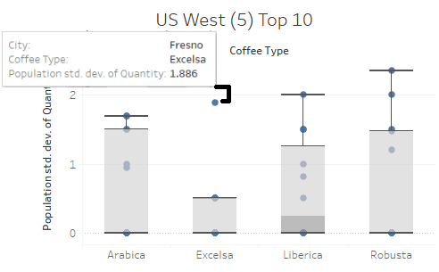
Among the top 10 buyers in the West, we don’t see much deviation from the pie chart. So let’s use the standard deviation and breakdown of sales to take a closer look. Right away in the Excelsa (Red) column we see Fresno as an outlier. Most of the Western region doesn’t seem interested in Excelsa coffee except for this one location. We might jump to the conclusion we can save money here but given the close proximity to Sacramento, another large buyer, the outlier averages itself out. This is a great example of critical thinking keeping us from misinterpreting the data!
Among the South, we find our first regional deviant: Charleston shows a dramatic preference for Robusta and for Arabica, while virtually no interest in Liberica or Excelsa. Fort Lauderdale shows similar trend as well. Recalling the regional pie chart we first looked at, the distribution was fairly proportional – meaning we have quite a bit of deviancy between individual cities that averaged out to a mundane pie chart. We could move Charleston into the Eastern Region and add a new trucking line, saving money on inventory by stocking a disproportionate amount of Excelsa in the East, where more is consumed. Fort Lauderdale is too geographically distant to move to another region, so it’s important to remember not all outliers demand action!
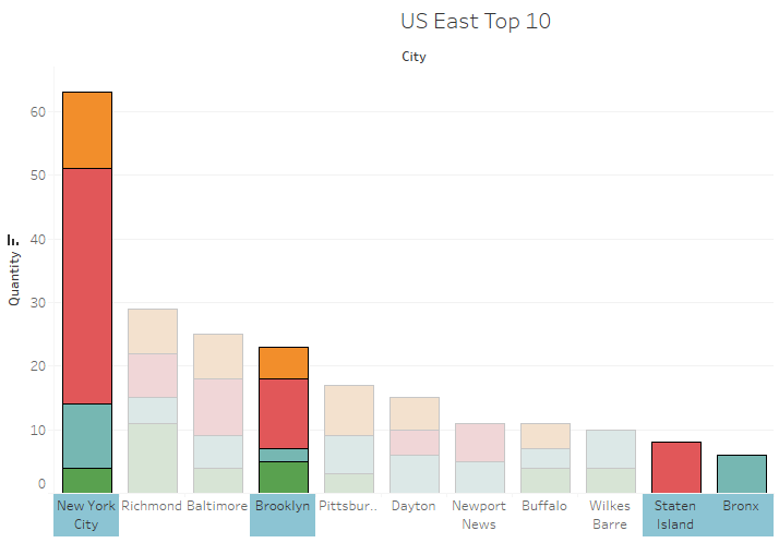
Speaking of the East – they are a great example of why multiple statistical tools paint the best picture. Looking exclusively at the pie chart, it certainly looks like the region as a whole loves Excelsa. But when we take a closer look at the East’s purchase data (East Top 10) it becomes clear that New York City is overwhelming the surrounding cities. Combining the outer boroughs, we see that New York City makes up more than x3 the next largest city, Richmond. I would suggest to marketing to focus efforts on NYC trends first and watch for increased purchase volume in the surrounding cities as an indicator to reassess strategy. I can set up a script to refresh this data on a monthly or quarterly basis.
Taking a look at the Midwest, we immediately see a trend of Arabica being the overwhelming winner for orders. That’s enough to modify inventory, but let’s consider logistics as well. I would suggest to leadership reevaluating our shipping hubs in the Midwest since the top 4 purchasers in this region are from Texas and Oklahoma. We could likely save significantly by dividing the Midwest in two – Texas and Chicago areas respectively. I’d be happy to provide more statistics here but at this level it just isn’t a great use of time and resources. Here, I would probe marketing and leadership on how they want to proceed before doing more work.
Lastly, we haven’t touched on roast level yet. Between bean type and roast level, Marketing can get a good idea of what new products will sell. A similar dashboard focused on roast level is a great starting point for further refinement. I would hold off on cross-referencing the two until more details have been shared on the products the want to test as an example of effective time & effort prioritization, as products align better with bean type than roast.
Summary
- We successfully combined our tables and filtered for relevant columns.
- We brought in an outside table to help plot our locations on the map. It would be a good idea to bring this table internal for future queries.
- We filtered our data by region – It would be a good idea to add this as a column to our demographic table
- Using Visual and Statistical representations we identified:
- A general ratio for each region’s shipping hub inventory
- Despite outliers in the West, only marginal increases to efficiency would be gained here without infrastructure changes
- The South could largely benefit from moving Charleston to the East region due to shared coffee bean preferences
- The East is so dominated by New York City’s preferences that catering directly to them is currently advantageous. We can set up a script to keep an eye on other cities in the region.
- The Midwest has their volume spread across many cities and would benefit from splitting into a Chicago shipping hub and a Texas Shipping hub
Next Steps
When presenting to leadership, it’s best practice to provide some next steps for direction moving forward. They can always modify as needed.
Logistics
- With leadership approval, inquire about new shipping hubs in the Chicago and Texas areas
- Discuss moving the Charleston shipping lane from the South hub to the East hub
- Acquire costs
- Put together a simple visualization showing cost-benefit ratio
- Circle back to leadership
- Provide regional inventory ratio to adjust inventory at regional shipping hubs.
- After some time, review the adjustment to measure against expected revenue changes
Marketing
- Address and notate any feedback during the meeting
- Inquire what regions line up with their current market strategy and offer to provide more tailored detail
- Discuss the details of new products and their attributes (Related to the tables available)
- Confirm if our discoveries align with expectations
- Provide a dynamic dashboard to marketing that updates weekly/monthly/quarterly to monitor improvements from our modifications.
Sales
- Work with Marketing to focus efforts on the New York City market
- Inform of any changes to regional strategies, cc Marketing
- Provide a dynamic dashboard or modify an existing one
Credit to Tableau Public for the interactive dashboards https://public.tableau.com/app/profile/c.baringer/vizzes
Credit to Kaggle for the Coffee Sales data
Credit to Wikipedia for the cities and states table
